6 wks
Brand migration time (was 18 months)
+12%
Baseline CVR improvement across five pilot brands
£2M
Annual saving from reduced duplication
95%
WCAG 2.1 AA compliance (from 30%)
The Travel Corporation operates 42 travel brands across 60+ countries, including Trafalgar and Contiki, carrying over 2 million travellers annually. The group specialises in organised, guided touring.
| Company | The Travel Corporation (42 travel brands, including Insight Vacations, Luxury Gold, Contiki, Costsaver, and Trafalgar) |
| Role | Lead Product Designer |
| Team | Founding designer, scaling to a team of 3 Product Designers and one researcher based in London and Katowice, within a wider cross-functional task force of 22 |
| Timeframe | Feb 2020 – Dec 2021 |
The problem: 40+ brand websites with no shared infrastructure and 18-month brand migrations.
The goal: Build a single B2C ecommerce platform and design system capable of serving the entire portfolio without rebuilding for each brand.
In late 2019, 80–90% of bookings happened through agents or by phone. Each brand had built its own website independently over 10+ years. The result was duplicated decisions, inconsistent patterns, and no shared infrastructure.
COVID halted travel in early 2020 but created a window. Customers were moving online. Competitors were waiting. If TTC could shift to a genuine B2C model before the recovery, it would be ahead.
The executive team had approved PO1 before COVID hit. When the pandemic forced cost cuts, the data team and additional design resource were removed from the programme. I joined in February 2020 as the founding designer and pressed ahead.
Brand politics threatened the clean-sheet approach
The biggest risk wasn’t technical. Brand CMOs had defended their decisions for over a decade. “We’ve always done it this way” was the default response to change.
We ran analytics audits across all 40+ brands and presented each brand’s conversion data against competitor benchmarks. That reframe shifted conversations from opinion to evidence. The pitch to the executive steering group wasn’t “let’s modernise.” It was “the legacy is a commercial liability.”
That framing secured clean-sheet approval. It was the hardest and most important sell of the project.
One system needed to serve 40+ distinct brand identities
The design system had to work for brands as diverse as a luxury escorted-touring company (65+) to a youth-adventure brand (18–30). Too rigid and brand teams would reject it. Too flexible and it would fragment within months.
I separated structure from style using a three-layer token architecture:
- Primitive tokens: Raw values with no context — colour palette, spacing scale, type scale, grid
- Semantic tokens: Values named by purpose — colour roles (e.g. primary action, surface, text), focus and state colours, typographic roles
- Brand theme layer: Brand identity applied by overriding semantic tokens only — Trafalgar maps primary action to navy, Contiki maps it to orange
One change at the core propagates across every brand. Each brand can update its identity without touching the underlying system. The system shipped with 40 components, each built once and reused across every brand.
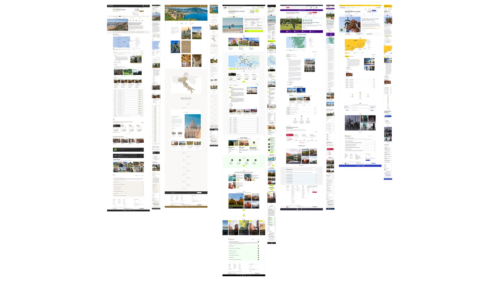
Same component, two brand themes
Title: Lead Product Designer. Founding designer on the central PO1 task force, scaling to a team of five across London and Katowice within a wider cross-functional group of 22.
What I owned:
- UX architecture across the full booking journey
- Design system built from scratch — Figma, Storybook, Zeroheight documentation
- Discovery research sprint (15+ user interviews, competitor benchmarking)
- The five design principles that governed every decision for the life of the programme
- Stakeholder alignment across 40+ brand CMOs and the executive steering group
- The analytics audit that secured executive approval for the clean-sheet approach
- Weekly design-data-engineering sync, established six weeks in when parallel workstreams began to diverge
What I contributed to:
- Scope governance — the framework that blocked feature creep throughout delivery
- Brand migration process at each stage
Why this role needed lead-level thinking: 40+ brand stakeholders defended 10+ years of legacy decisions. The role required someone who could challenge opinion with evidence, design at a systems level, and operate as a strategic partner to product and engineering leadership. A senior IC focused on screens alone wouldn’t have moved the organisational blockers.
Leadership mode: Design Architect setting standards for the programme. IC on high-stakes features. Design Lead directing a distributed team.
The pivot: Three months in, the business rejected my original proposal. A PWA with a stepper booking flow was too unfamiliar. I refactored to familiar web patterns while keeping the performance improvements underneath. The lesson: brand stakeholders made visual decisions. High-fidelity mockups unlocked approval. Abstract architecture didn’t.
Stakeholder management: I presented bi-weekly to the leadership quartet (Global CEO, CTO, CDO, Programme Director) and monthly to the full CMO group. Each steering meeting opened with a one-sheeter re-anchoring the group on the five design principles before reviewing progress. That ritual blocked scope drift at executive level before it reached the team.
Standards I set: Five design principles used as decision filters for the entire programme. Every scope request was tested against them. “Does this serve B2C conversion?” ended most additions quickly.
Five principles before any design started
These weren’t values on a wall. They were decision filters applied at every fork in the road:
- Start from a clean sheet — no legacy decisions inherited by default
- Design for B2C only — no hybrid compromises
- Prioritise performance and conversion over aesthetic preference
- Validate assumptions before building
- Build once, reuse everywhere
Discovery surfaced three portfolio-level blind spots
Analysing brands in isolation had hidden the biggest drop-off causes. They only became visible at portfolio level:
- Navigation and search was the single biggest friction point across the portfolio. This shaped the information architecture on every template.
- Price clarity — users couldn’t distinguish price-per-person from total trip cost. This drove a dedicated pricing pattern across all tour pages.
- Booking confidence — lack of clarity around group sizes caused significant drop-off. This shaped the social proof and group dynamics content on every tour page.
Three forks in the road
PWA vs. familiar web patterns. The first direction was a PWA with a stepper booking flow. The business rejected it — too different from what brands knew. I refactored to familiar patterns while keeping the performance improvements underneath. The trade-off: a more conservative visual approach in exchange for faster approval and delivery.
Design system first vs. later. On a tight deadline, building the system upfront felt like a risk. I did it anyway. Every migration after the first paid back the investment.
Mobile-first vs. desktop-first. Research showed users started on mobile but completed bookings on desktop — typical for high-consideration purchases where people switch to a larger screen to review details and commit. I designed mobile-first to ensure the entry point was solid, then scaled up. This shaped scroll depth and information hierarchy across every template.
Business impact
| Metric | Result |
|---|---|
| Brand migration time | 6 weeks (was 18 months) |
| Baseline conversion | +12% across five pilots |
| Annual saving | £2M |
| Page load performance | +40% |
| Design-to-dev handoff | -70% |
Pilot brands in sequence: Insight Vacations, Luxury Gold, Contiki, Costsaver, Trafalgar.
The £2M annual saving came from centralising design and engineering. Previously every brand duplicated the same work for every new feature. PO1 replaced that model with a single component library of 40 components, built once and reused across the portfolio via the token architecture. That eliminated per-brand infrastructure and production costs entirely.
User impact
| Metric | Result |
|---|---|
| WCAG 2.1 AA compliance | 30% to 95% |
| Bounce rate | -15% |
| Average time on tour pages | 3min 47sec (excl. bounces) |
| RAQ conversion (north star) | 0.22% |
RAQ (request a quote) was the north star at MVP. £5k+ guided tours don’t convert like retail. A 0.22% RAQ rate with 3min 47sec average dwell time on tour pages indicates strong purchase intent from the right audience.
Org and process impact
- First enterprise-wide design system for a group carrying 2M+ travellers
- One design team capable of supporting 40+ brands
- A repeatable discovery and validation process embedded across every brand migration
- Formal scope governance that blocked feature creep throughout delivery
When I left, the system ran without me.
What I'd do differently
- Instrument analytics earlier. Tracking was added after launch. Early pilot data was incomplete as a result. Tracking requirements should be embedded in the design system from day one.
- Map stakeholders before opening Figma. I underestimated brand politics in the first six weeks. Too much time designing, not enough time pre-selling the clean-sheet principle. A structured stakeholder mapping exercise at the start would have saved weeks.
- Protect the research budget. The data team was cut due to COVID cost measures. Usability and guerrilla testing worked, but couldn’t properly reach the primary demographic: 60+ year-olds booking £5k+ trips. I should have advocated more strongly to protect that budget when the cuts came.
What this changed
The most important output on a project like this isn’t the design. It’s the conditions that allow good design to happen repeatedly without you. The governance model, the principles as decision filters, the scope document as a contract: these had more long-term impact than any individual component.
Where the system should go next
The token architecture is built for visual consistency. The next step is instrumented components: design tokens tied to analytics so teams can measure component performance in production. With enough platform data, the infrastructure exists to move from pattern reuse to personalised journey assembly.