+4.14%
CVR uplift (GB, unified basket)
+4.75%
Margin per transaction (all markets)
+20pts
User comprehension vs control
80%
Users who preferred the new design
UK regulators required travel companies to show the full cost of a holiday upfront, including fees paid at the hotel on arrival. Competitors treated it as a legal task. We treated it as a trust problem. That shift in framing was the difference between a compliance fix and an overall product improvement.
Result: +4.14% CVR uplift across the GB market, +4.75% margin per transaction across all markets, and full regulatory compliance delivered ahead of the April 2026 enforcement date.
| Metric | Result |
|---|---|
| CVR uplift (GB, unified basket) | +4.14% |
| Margin per transaction (all markets) | +4.75% |
| User comprehension vs control | +20 points |
| Users who preferred the new design | 80% |
| Engineering lead time for pricing changes | 3 weeks → under 1 week |
The problem: The business ran four failed pricing experiments across two product squads, resulting in CVR drops ranging from -5.8% to -10.82%. A hard regulatory deadline was approaching, and there was no unified design ownership of the end-to-end journey.
The goal: Achieve regulatory compliance without degrading conversion — and use the constraint to improve pricing comprehension across the full booking experience.
My scope: Cross-functional programme spanning two product squads. 2 PMs, 2 Engineering leads, 7 engineers, 2 embedded designers (both directly managed by me), 1 researcher, 1 content designer, and legal review.
Why a Principal was needed: Previous attempts had been scoped within individual squads with no single design owner across the end-to-end journey. There was no shared design principle, no joined-up user journey, and no one forcing the structural conversation between Search Platform and Checkout. The VP of Product and Director of Design brought me in specifically to change that operating structure and own the outcome end-to-end.
loveholidays is a UK package holiday OTA selling flight-plus-hotel packages. Unlike a standard OTA, customers pay the base package price at checkout. Tourist taxes and resort fees — such as city taxes or mandatory hotel resort charges — are paid separately, directly to the hotel on arrival.
This split-payment model made compliance harder than it seemed. Showing a higher headline price without explaining the split created the appearance of a price increase, which is exactly what the failed experiments confirmed.
The CMA was gaining direct enforcement powers from April 2026, with fines levied without court involvement. Warning letters had gone to 19 travel companies. Booking.com and Expedia were already compliant for hotel-only flows. Key package holiday competitors — TUI, Jet2, BA Holidays — were not.
That created a specific commercial risk. Showing fully loaded prices while competitors still showed base prices would make loveholidays appear artificially expensive. Compliance couldn’t come at the cost of conversion. The VP of Product made that explicit when resetting the brief.
1. Four failed experiments and an approaching deadline
Before I joined, two product squads had each attempted solutions to inclusive pricing. Every experiment produced the same result: users saw a higher price with no context, and conversion dropped.
| Experiment | CVR impact |
|---|---|
| Taxes and fees inclusive pricing | -10.82% |
| Local tax included in total (test 1) | -5.8% |
| Local tax included in total (test 2) | -6.5% |
The pattern was clear. The problem wasn’t the price. It was the absence of explanation. No one had owned the full journey across all pricing touchpoints to allow for smooth comprehension at the point of purchase.
2. A structural problem underneath the design problem
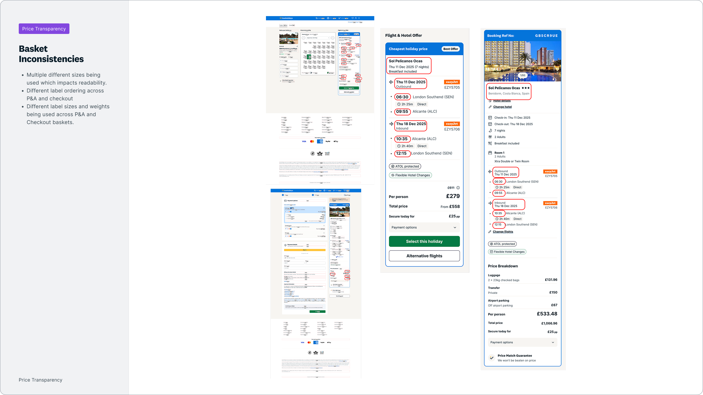
Search and Checkout ran separate, hardcoded basket components — each maintained independently by different squads. The basket appears at multiple points in the booking funnel: on search results, on the hotel details page, and within checkout. When each squad maintains its own design, any change to one surface doesn’t carry through to the others — creating price inconsistencies across different stages.
This wasn’t just technical debt. It was the reason every previous transparency attempt had drifted between surfaces. Any design work built on two independently maintained components would break the moment either team shipped a change. This had to be resolved before anything else could land consistently.
3. A data confidence gap with direct IA implications
Tourist tax data at the destination level was reliable. Hotel fee data from third-party suppliers was not — figures could be incomplete, delayed, or variable. This constrained the information architecture. I couldn’t confidently include hotel fees in a headline total if the figure might be wrong further down the journey. The design had to account for what could be displayed at each stage, and be honest about uncertainty where it existed.
My title and remit: Principal Designer. Design lead across the full programme. I set direction for both squads, owned all IA decisions across SRP, basket, and checkout on web and app, and directly managed the embedded designers.
The pivot: Three weeks into the basket redesign, results came back at -8.92% CVR, significant at 99.9% within 72 hours. The drop wasn’t uniform — it was concentrated. Destinations with high tax coverage (75%+) saw a -8.85% drop in CVR. Destinations with zero taxes dropped by just -0.86%. The steepest fall was at Search > Price and Availability, where users encountered a higher price with no explanation for the difference.
This wasn’t a blanket rejection of inclusive pricing. It was users struggling to make decisions when they didn’t understand the fee jump. That distinction mattered.
There was pressure to push ahead. The regulatory deadline was close and the team had invested significant effort. I made the call to stop the experiment and address pricing alignment across the journey first. The usability data told a different story from the CVR: 90% of users understood what was due now, rather than at the hotel — a 20-point improvement in comprehension over the control. The direction was right. The implementation and sequencing were wrong.
Deciding to stop and separate those two things was the decision that unlocked the next phase. I presented this directly to the VP of Product, with usability data alongside the CVR result, and made the case that continuing would compound the structural problem rather than solve it.
Stakeholder influence: I presented the case for basket consolidation to VP Product and VP Revenue as a programme prerequisite. The argument: any transparency model built on two independently maintained components would drift the moment either team shipped a change. The Netherlands market had partly solved this using a reusable component for the price breakdown section. Consolidating the entire basket into a single shared component would take one week, not a full rebuild. They agreed.
Standards I set: I defined the design principles governing the full programme, created the IA for the new pricing items and the variants needed to maintain consistency across regional formats, and owned the decision-making framework across both squads. The embedded Search Platform designer handled execution and iteration within that direction.
Decision log 1: Stop the basket redesign at -8.9%
- Option A: Continue iterating under deadline pressure
- Option B: Stop, diagnose, resequence
- I chose B. The CVR drop was concentrated in high-tax destinations, not universal. That told us the problem was comprehension, not the pricing model itself. Continuing would have locked us into a sequencing model where users encountered a new price total before any earlier touchpoint had prepared them for it.
Decision log 2: Unify the basket before building the design
- Option A: Build transparency on top of the existing separate components
- Option B: Unify first, then build
- I chose B. Option A would have produced inconsistent results across the journey and required double the maintenance for every future pricing change. Any new fee type or layout variant would need to be built and tested twice.
Decision log 3: Persistent disclosure over gated acknowledgement
- Option A: “Clear on cost” popover requiring user acknowledgement before browsing
- Option B: Persistent, contextual disclosure on every search result card
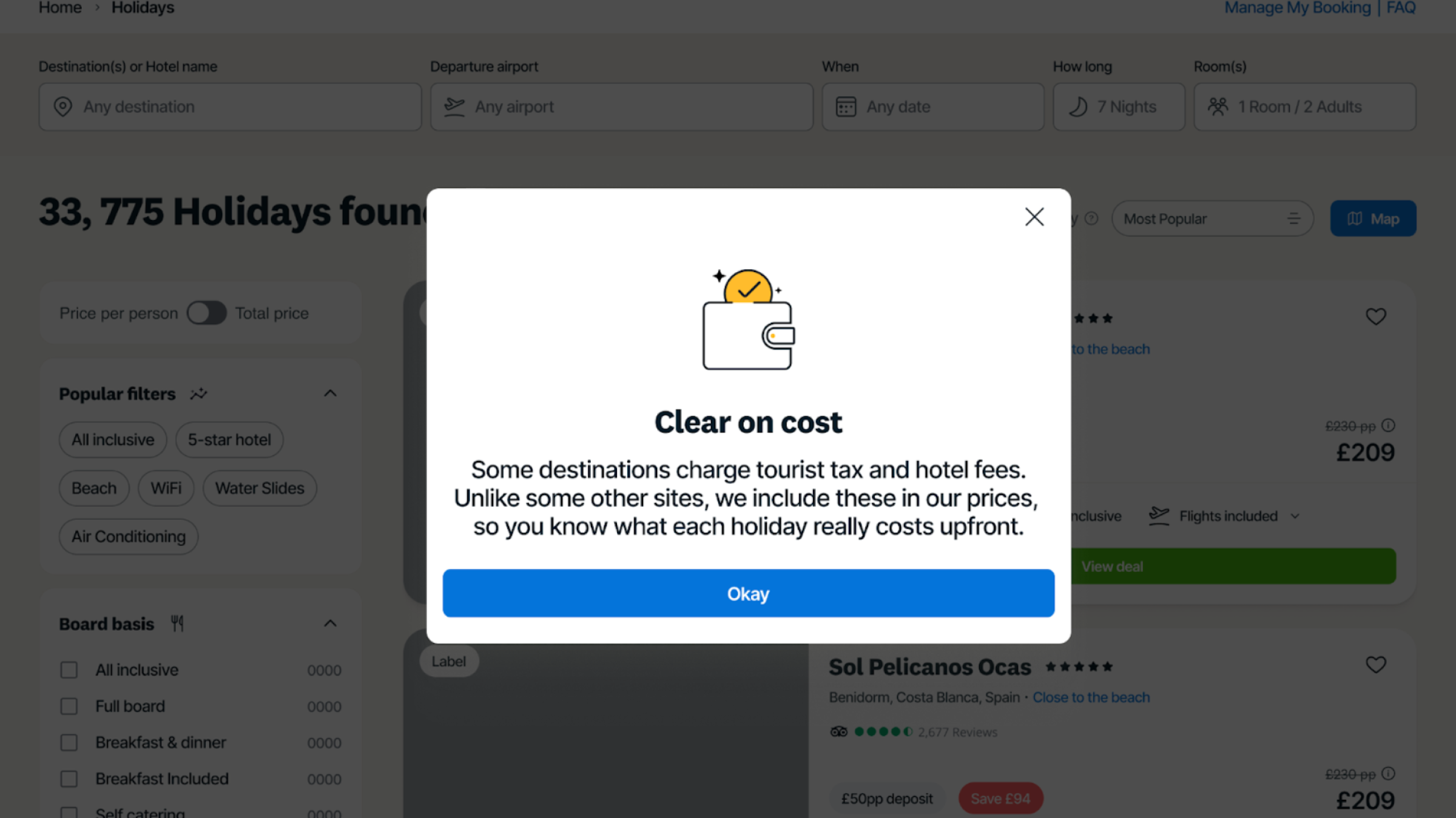
- I chose B. Testing a large dismissible popover — designed to explain inclusive pricing upfront so it could be removed from individual SRP cards — failed. Users closed it immediately and then lost trust when browsing. “I clicked it away — now I’m not sure if these prices include everything.” Transparency had to be visible at all times, not gated behind a single interaction.
 Option A — Gated acknowledgement
  Option B — Persistent disclosure
 What the research told us
Three patterns shaped every major decision. Tooltip-only disclosure failed on mobile — hover states don’t exist on touch devices — and on desktop, it felt like deliberate hiding. One-time acknowledgement gates improved comprehension in the moment but didn’t hold once dismissed. And shorter copy consistently reduced comprehension. “Local taxes collected by the hotel” outperformed “Taxes & Fees” in every variant test. Users wanted the full sentence, not a label.
The solution — three interconnected changes
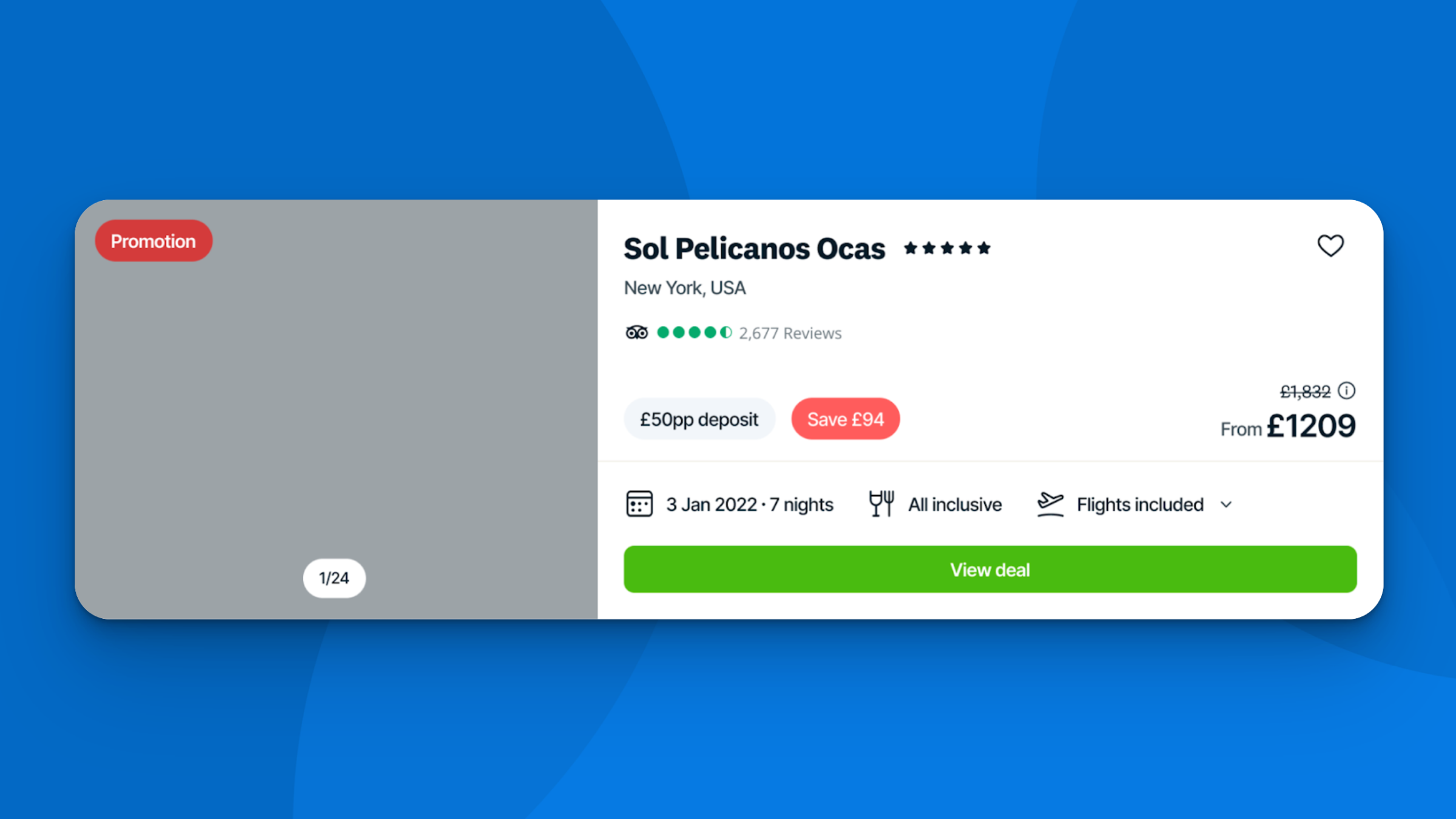
Search result cards now show the additional fee amount persistently — for example: “An additional £XX in local fees is due at this hotel, making the total £X,XXX.” Tooltips clarify why fees apply and who collects them, not whether they exist.
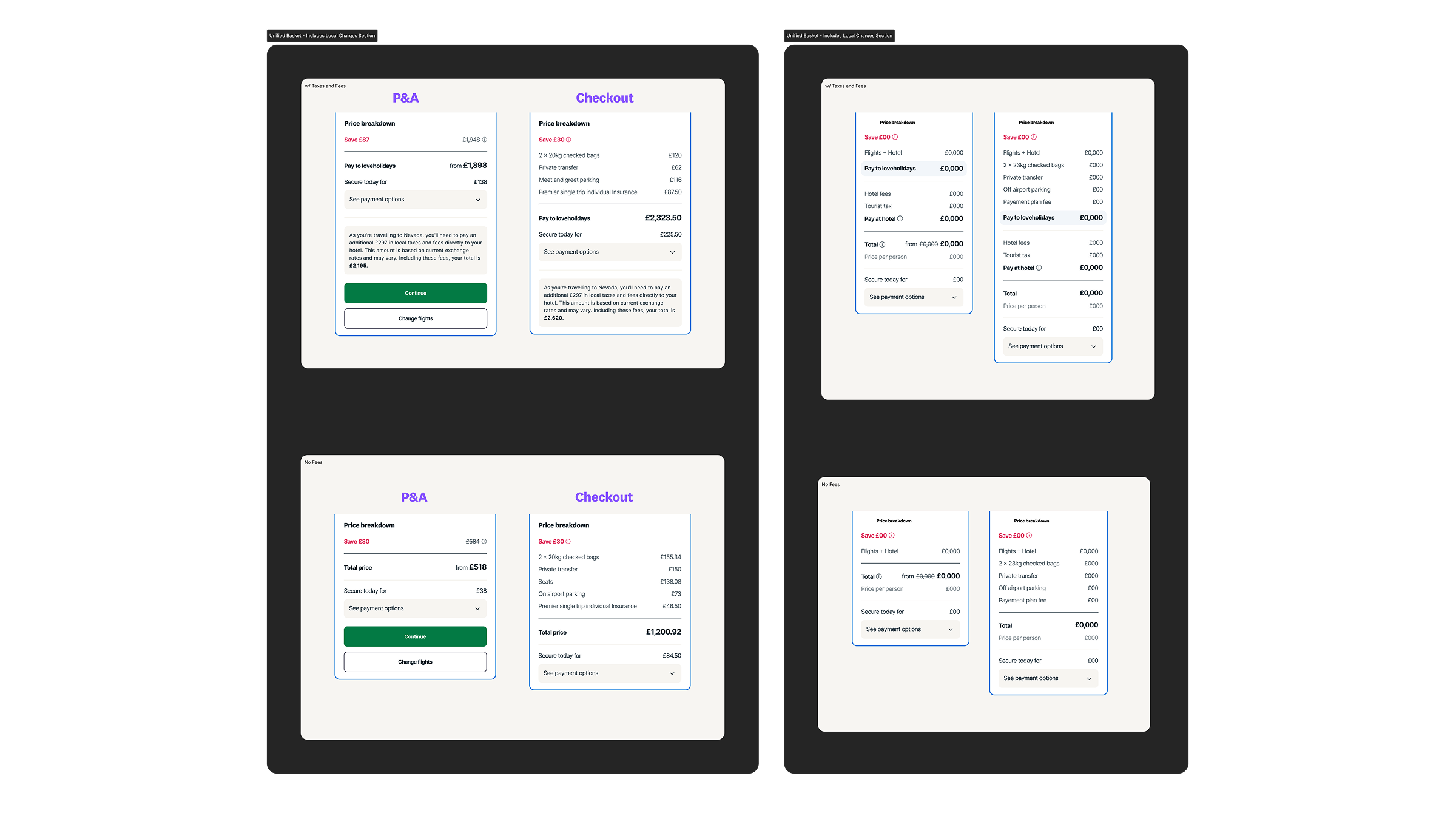
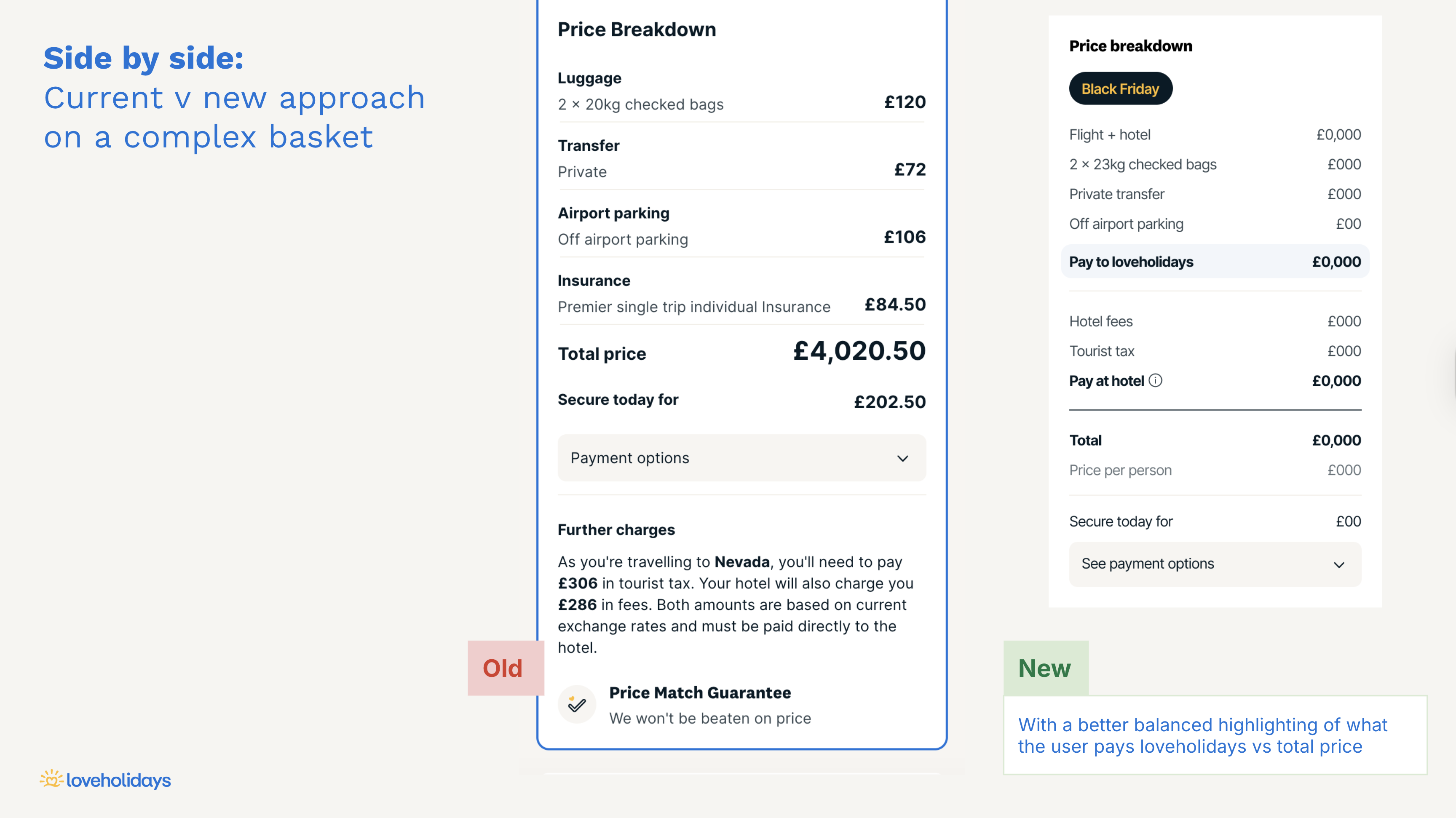
The basket uses a chronological breakdown proven in the Netherlands market: Pay today (to loveholidays) + Pay at hotel (local taxes and fees) = Total trip cost. One scannable view. No arithmetic required. Regional variants maintain consistent layouts despite different tax structures or regulatory requirements.
The unified basket component lets Trading teams toggle tax displays and per-person pricing by market without engineering involvement — turning a hardcoded surface into a configurable commercial platform.
Product and business
- +4.14% CVR uplift, GB market (combined outcome across unified basket and SRP transparency)
- +4.75% margin per transaction, all markets
- Desktop: +7.7% CVR uplift. Mobile: +6.8% CVR uplift
- Middle funnel (offer summary to passenger details): +3.64%
- Full CMA compliance ahead of April 2026 enforcement
User
- +20 point comprehension improvement (what’s due now vs at hotel)
- 80% of users preferred the new design over the control (quantitative usability testing)
Org and process
- Engineering lead time for pricing-related UI changes: 3 weeks → under 1 week
- Experiment velocity: 3x more variants per month in Q2 2026 vs Q4 2025
- Formal shared ownership between Search Platform and Checkout was agreed for the first time
- The unified basket component is now the foundation for pricing work across all markets — any new fee type or point of sale can be introduced without a redesign
What didn't go well
The hotel fee data confidence gap emerged late, creating mid-programme IA constraints. A data audit at the start would have shaped the architecture earlier. I’d treat that as a discovery prerequisite on any future pricing programme.
The Netherlands rollout was grouped with GB for technical reasons — code complexity made separate testing impractical. The uplift in NL was +1.2% against a higher baseline, which suggests the approach translated. But the Dutch market had specific regulatory nuances that deserved more rigorous validation. Next time, I’d push harder for market-specific research even when technical constraints limit what’s testable.
“Pay at hotel” caused comprehension issues across multiple rounds of testing. The terminology should have been validated in research, not refined through live iteration.
What this changed
The unified basket and additive pricing model are now the standard across all markets. The design system work done here set the pattern for how pricing changes get introduced — one component, one owner, one source of truth.
Where this goes next
Three things are unresolved:
- Strikethrough price alignment — currently references the holiday base price, not the fully-loaded total. That needs to close.
- Dynamic discount badges — campaign and discount badges are static. The next version should dynamically calculate and display the actual discount against the total price.
- Zero-tax destinations — the transparency narrative should extend to “No local fees due” messaging, turning compliance into a differentiator rather than just a requirement.
See the work live